In the digital landscape, your website is more than just a virtual storefront—it’s your digital ambassador, the first impression you make on potential customers.
Just like in a physical store, creating an inviting atmosphere, making a lasting impression and guiding visitors towards a purchase is the key to success. Let’s delve into three must-haves that elevate your website and turn website visitors into paying clients…
1. Clear and Compelling Call to Actions (CTAs)

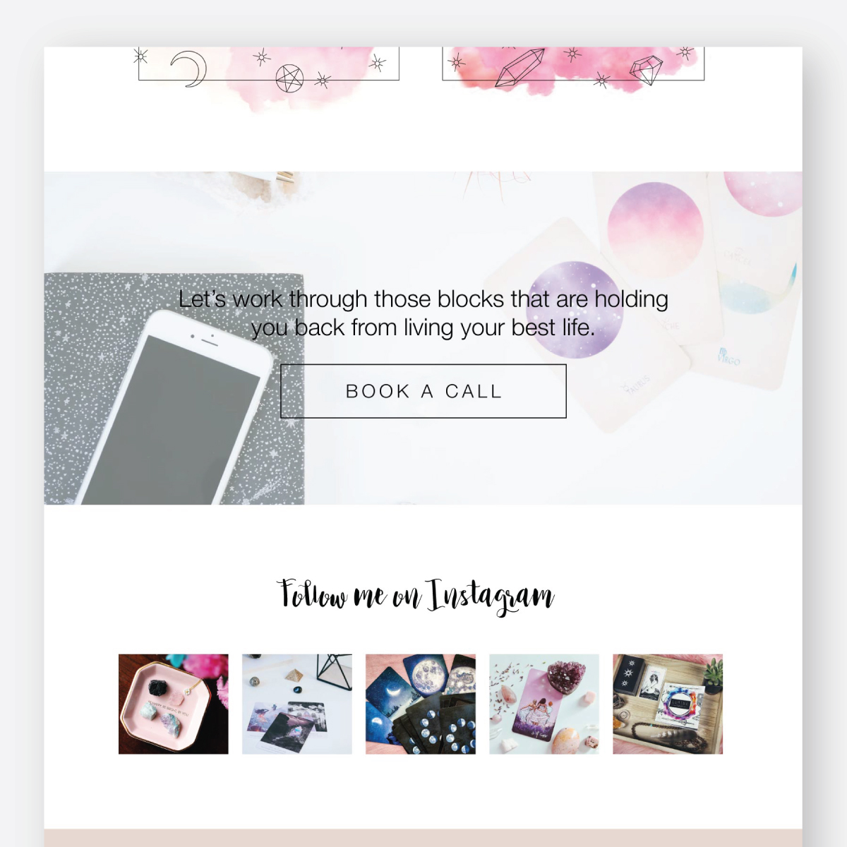
Picture walking into a beautifully curated boutique, only to find that the checkout counter is hidden in a corner, obscured by racks of clothes. Frustrating, right? The same principle applies to your website. CTAs are the signposts that steer visitors towards taking the desired action—whether it’s making a purchase, signing up for a newsletter, or scheduling a call.
However, it’s not enough to scatter CTAs throughout your site haphazardly. They need to be strategic, prominent, and enticing. Don’t hide them at the bottom of the page or bury them beneath a mountain of text. Instead, place them strategically where they’re easily visible and can’t be missed. Remember, if you want the sale, you’ve got to ask for it.
2. Seamless Experience
In a world where attention spans are shorter than ever, a website that feels like a labyrinth is a surefire way to lose conversions. Clunky, confusing websites quickly drive potential clients away. That’s why prioritising a good experience is crucial.
Your website should be a breeze to navigate, guiding visitors effortlessly from one page to the next, making it easy for them to find what they’re looking for and take action.
Keep your design clean and clutter-free, minimise distractions, and ensure that navigation is straightforward. Every interaction should feel effortless and guiding visitors towards the desired outcome—whether it’s signing up for a programme or getting in touch with you. By streamlining the experience, you make people feel safe and ultimately, convert.
3. Authentic Representation of Your Brand

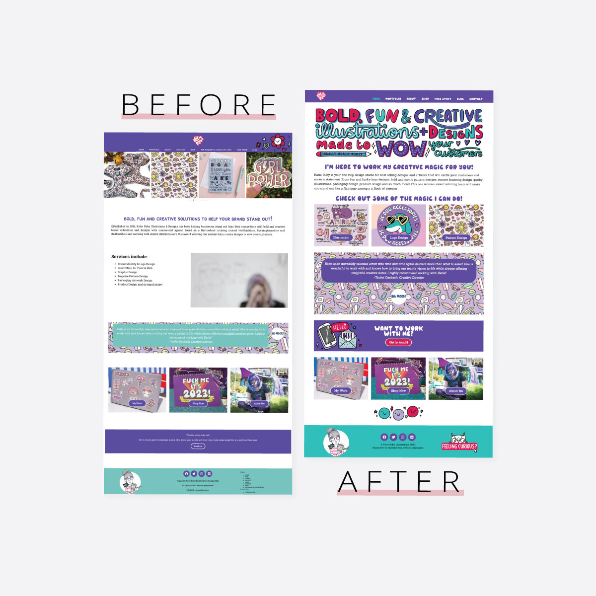
Your website is more than just a digital storefront—it’s a reflection of your brand identity and values. But here’s the thing: if you’re selling a high-end luxury service but your website looks DIY, clunky or thrown together in a hurry, it sends mixed signals to potential customers. They may question your professionalism, expertise, and the value of your offerings.
Investing in a website that accurately represents your brand is essential for building trust and credibility. From the design and imagery to the tone of voice and messaging, every element should align with your brand and resonate with your target audience.
When visitors land on your site, they should immediately feel confident that they’re in the right place—that they’re dealing with a reputable, trustworthy brand they can relate to and ultimately, do business with.
Ready for a highly converting, professional website that represents your business?
A high-converting website is not just about flashy design or fancy features. It’s about crafting an accurate representation of your business that high-class clients expect to see. And by incorporating these three essential elements into your website strategy, you can create a digital portfolio that attracts these clients and get them landing in your inbox on autopilot.

But creating a high-converting website that authentically represents your brand is often a challenge many of my clients face. As a professional designer, I specialise in transforming your website into a true reflection of your high class brand.
If your website letting you down, and you’re done struggling on your own, work with me and let’s fast track your website into a professional site that automatically direct high-level clients into your inbox and programmes!
